Pit Stop
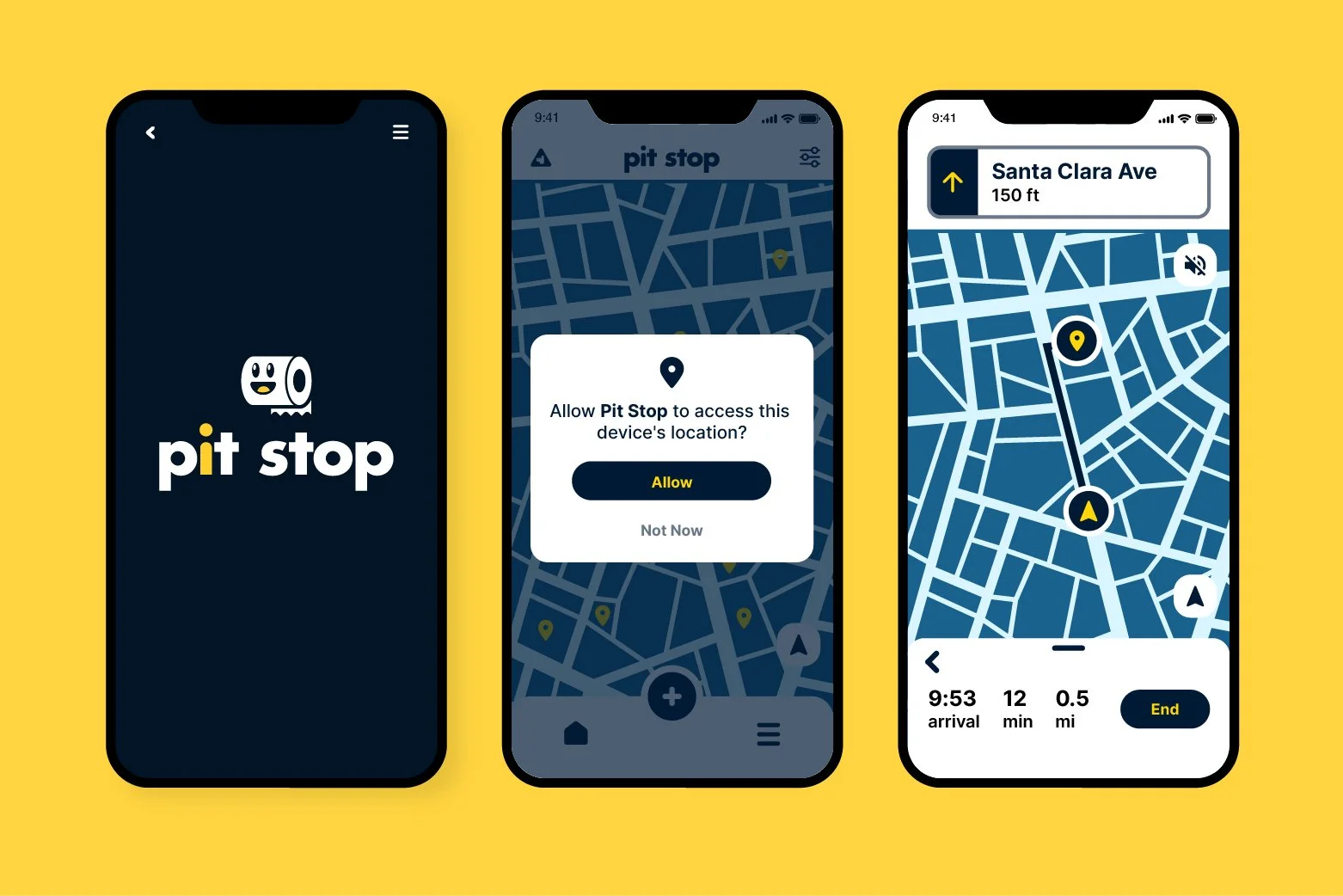
In a collective effort my group and I set out to develop an app that is accessible to individuals with 20/70 vision, color blindness, and dyslexia. After heavy research and an emphasis on color/typographic studies, we developed an app dedicated to facilitating a user’s journey to finding the nearest restrooms to their location. In addition to being an aide, users within this app are also able to find new and undiscovered restrooms, add them, rate them based on their cleanliness, and save for future use, ultimately building a community within the app.
UX/UI App Design
My Role: UX/UI Design, Branding/Logo design, Prototype Development, and UX/UI Competitive Research
The Team: Ada Loong, Emmeline Lam, Mikayah Arbizo
I had the responsibility in analyzing and researching similar apps and competitors. The process was to experience these first hand, observing what trends were most popular within, design layouts, and what they all shared amongst each other.
Competitive Analysis & Research
The colors Y-Tri is measured and calculated based off its distance from the color white. In this instance, it was measure through the Classic Color Meter app from App Store on MacIntosh computers.
Color Palette
Iconography
In efforts to make Pit Stop a fun, friendly app, I opted for designing a fun, friendly logo. The light-hearted icon of a toilet roll. I wanted a fun icon that could stand on its own. In addition, the word mark “Pit Stop” contains a subtle homage to a gender illustration on bathroom stalls.

