Final Touch Design
Brand Logo & Identity
Final Touch Design is a start-up specializing in hardwood, tile, carpet, and flooring installation. With over 25 years of industry experience, they deliver consistent, reliable, and professional service, ensuring high-quality results for every client.
The Problem
The client wanted to present themselves as a mature, well-established business, despite being a start-up. With a team boasting over 25 years of industry experience, their goal was to project reliability and professionalism, ensuring client satisfaction with their work.
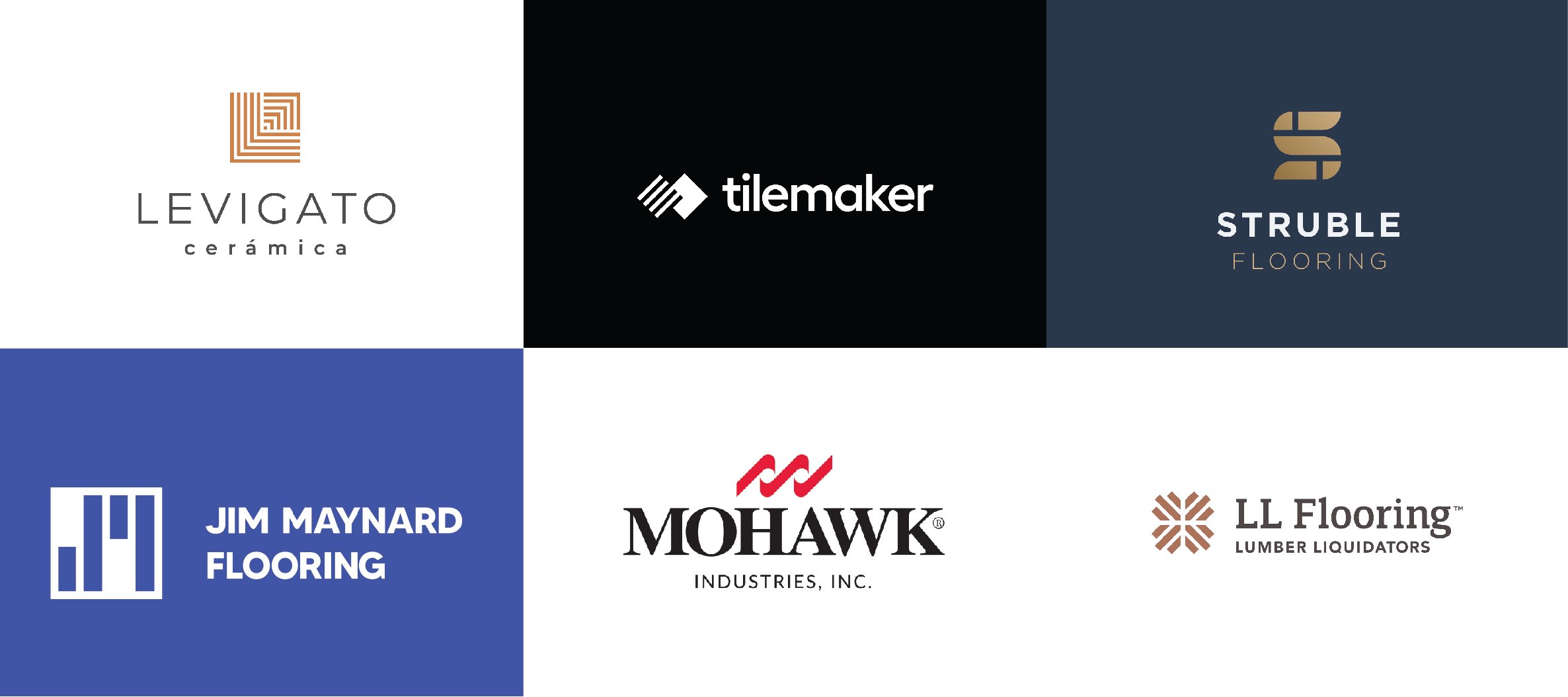
I conducted a comprehensive competitive analysis, examining how similar businesses within their industry and region positioned their brands. My objective was to design a solution that aligned with the client’s business goals, met their needs, and differentiated them from competitors through a professional and impactful brand presence. Collected logos from competitors are displayed below.
Competitor Research


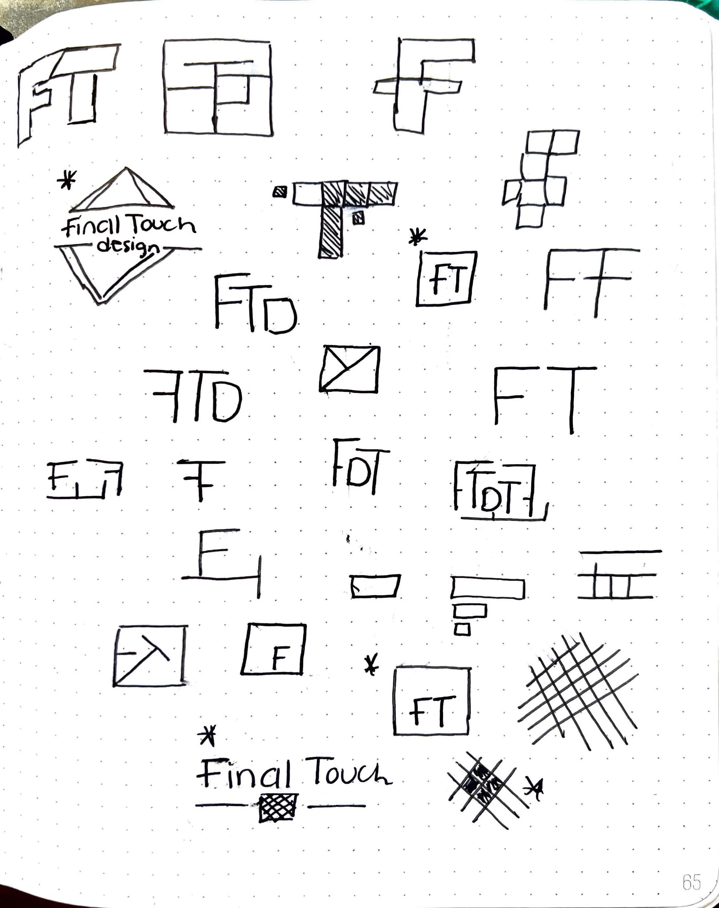
Sketches & Direction

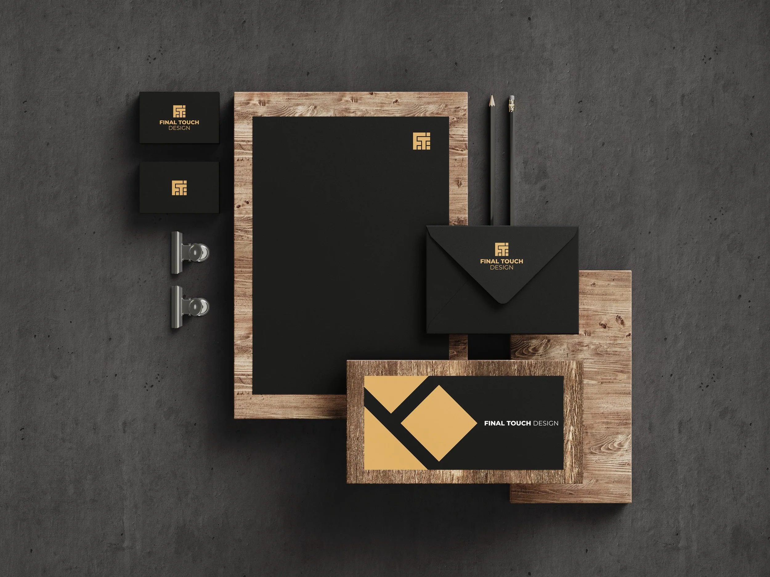
The Final Logo
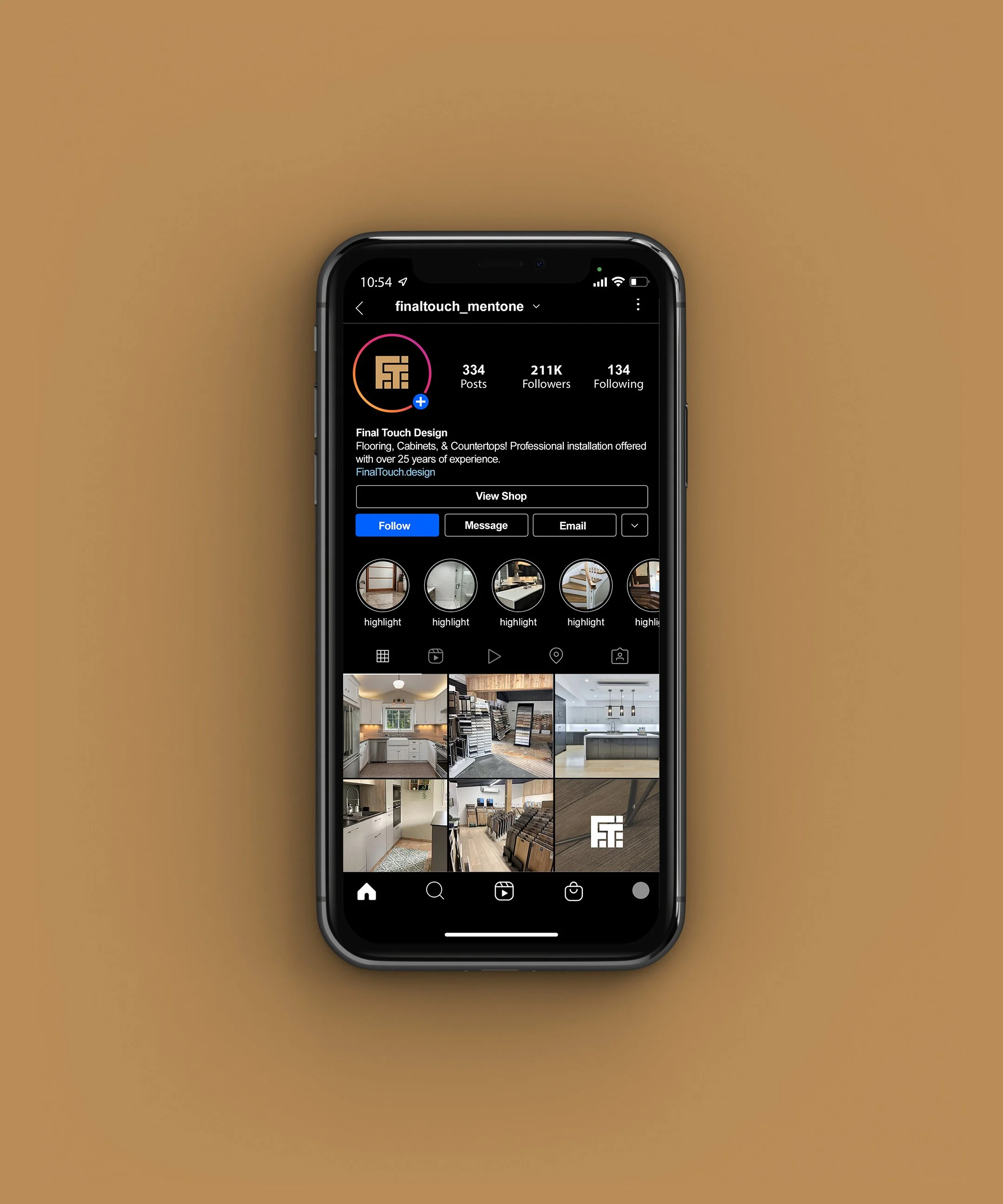
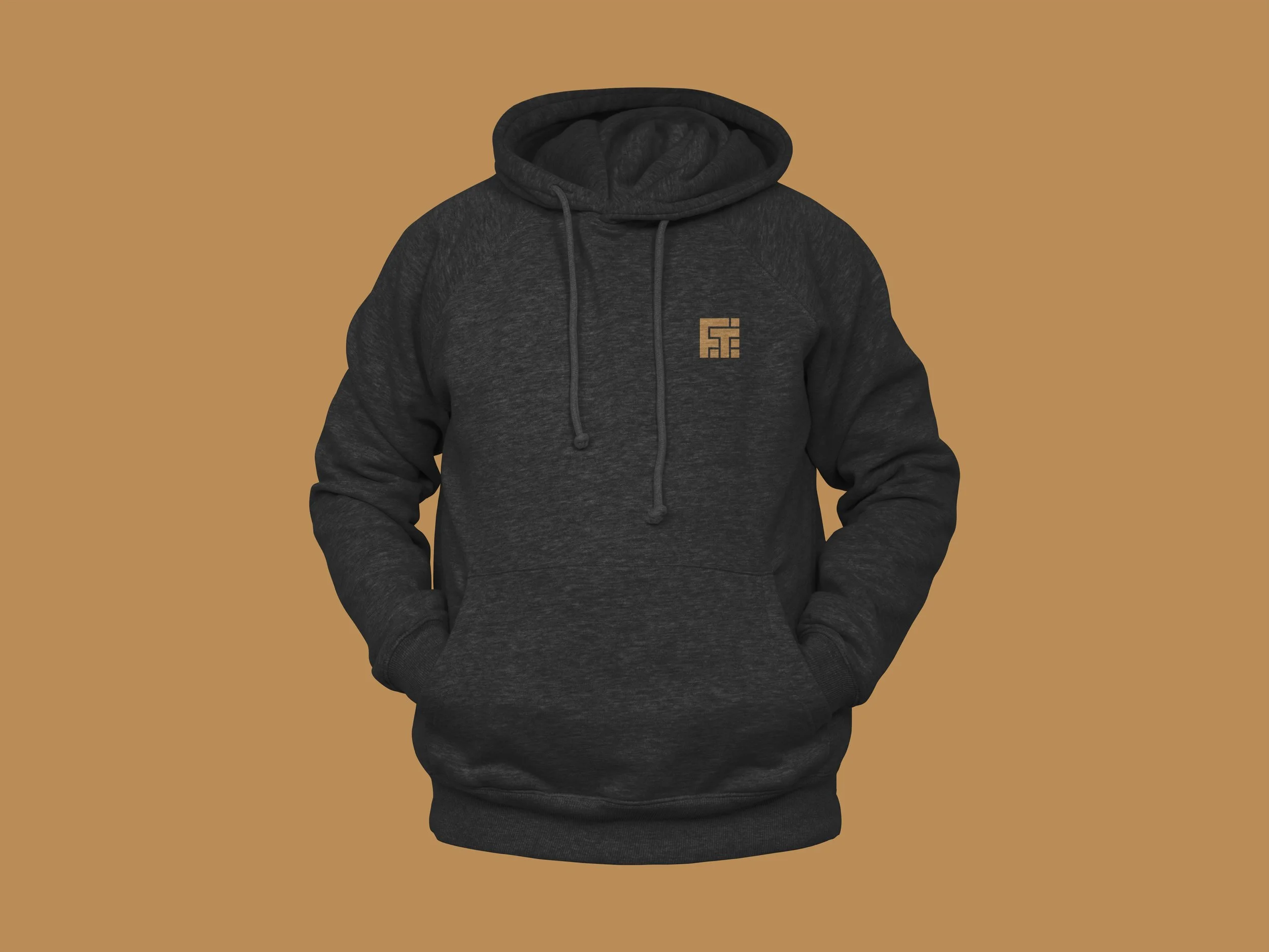
The icon is designed to resemble the shape of a flooring area, with geometric cuts symbolizing tile. Subtly integrated into the design are the letters 'F' and 'T,' representing Final Touch. This minimalist approach effectively communicates both the brand identity and its services. The icon's simplicity ensures it is highly versatile, scalable, and easily recognizable across various applications, including business cards, websites, apps, and social media platforms.
Vertical Layout
Horizontal Layout
Logotype